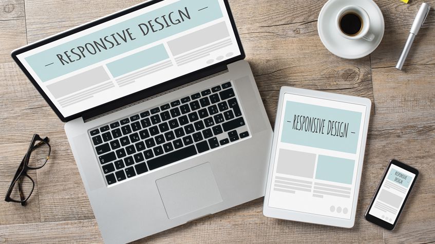
These days, a website designer can’t ignore the fact that websites aren’t just being viewed on laptops and desktop computers, even Google has made it a necessity for all websites to be built ‘mobile-first’.Every man and his wife either has a Smart Phone, a Tablet device or another gadget that lets them browse the internet on-the-go or away from a standard desktop computer. This is great for the user, but it does make designing a website more complex than ever before.
Here are a few technical and not-so-technical tips that we follow when creating a website and taking into account the requirement for mobile-first browsing:
Design with Mobiles and Tablets in mind
What is a Call-to-Action? Well, quite simply it is an element that calls a website visitor to make an action. This could be clicking a button that links to a contact page, or filling a form in for some sort of incentive; perhaps a free download. Either way, the Call-to-Action is there to catch the attention of the person browsing a website and to direct them to complete that important action which converts them from a website visitor into a lead!
Use Percentages in your CSS
Using percentages for divs and containers in your CSS will allow your columns and other elements to shrink and stretch with the screen size. For example, your header div may be 100% width, your main content may be 70% and your sidebar 30% width. Then combine the width percentages with a max-width value in when using pixels.
Use Media Queries
Media Queries allow you to target specific sized browsers with CSS to only be processed by them. For example, you could set a CSS rule for a screen size of 320px or less which makes your font size bigger and easier to read on a small screen.
Make images flexible
Again, use CSS to target images for when they are being viewed on different devices. I usually set images to 100% width when being viewed on Mobile device screens. This means they are easier to see and click on.
Remember the sizes
As a general rule of thumb, I target up to 320px width for Mobiles; 768px max for Tablets; 1000px for Tablets in landscape mode and anything above for laptop and desktop computers.
Try and use SVG images
SVG images are a new thing. SVG stands for Scalable Vector Graphics, and make for crystal-clear images on a website that can scale up or down in size without losing clarity or sharpness. SVG is ideal for more simple images, however for images containing more detail, best to stick to PNG.
I hope the above gives you some insight into designing for Mobile and Tablet devices. If you are looking to have a new website built, or perhaps need clarification on the above points then feel free to contact us on 020 3637 4885 or via our contact form! We look forward to hearing from you!